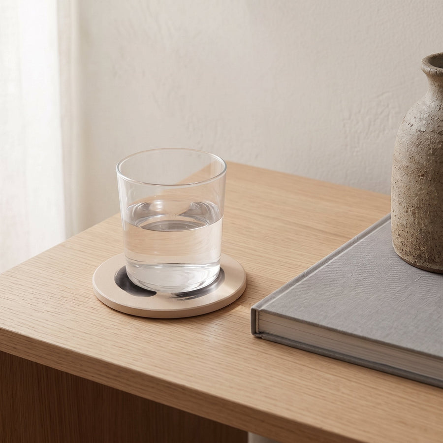
Here are five Japandi colour palettes with exact hex and RGB codes, ready to paste into Canva, Figma, a paint-matching app or a moodboard. Each palette has a base neutral, two supporting tones, one accent and one dark, which is the proportion most Japandi rooms settle into. If you searched for a Japandi color palette code in American spelling, this is the same list.
The codes describe the colour on a screen. A wall or a cushion never matches a screen exactly, so the last section explains how to move from a hex value to a paint chip or a fabric swatch without losing the tone along the way. For the thinking behind the palette, our longer Japandi colour palette guide explains why these tones sit together.
How to read a Japandi colour palette code
A hex code is six characters after a hash, describing red, green and blue in pairs. Japandi tones are easy to spot in hex: the three pairs are close together (which makes a neutral) and the first pair is usually a touch higher than the last (which makes it warm). A code like #E9E2D6 is a warm white; #E2E4E8 is a cool one, and cool is what most Japandi rooms should avoid.
RGB is the same information as three numbers from 0 to 255, which some paint-matching tools ask for instead. We give both. Where the palettes below lean on a colour name, the name is ours, not a paint brand's.
Palette one: rice paper and oak
The default Japandi scheme. It suits north-facing rooms and anywhere with pale wood floors, and it is the palette most of our own art is drawn to hang against.
- Base, rice paper: #F2EDE4 (242, 237, 228). A warm white with a drop of ochre; use it on walls and ceilings.
- Support, oat: #DDD2C2 (221, 210, 194). The colour of undyed linen; bedding, curtains, sofa.
- Support, pale oak: #C9AD8A (201, 173, 138). Floors, frames and the lighter of two woods.
- Accent, sage: #9AA48C (154, 164, 140). One cushion, one ceramic, one stem.
- Dark, sumi: #2B2A28 (43, 42, 40). Not pure black but ink black with warmth; lamps, frames, a single line of art.
Palette two: plaster and clay
Warmer and closer to the wabi-sabi side of the style. It works in cooler light, where the pink and terracotta lift the room, and it flatters darker oak and walnut.
- Base, lime plaster: #EEE4DA (238, 228, 218). A pink-leaning off-white that reads as white until a pure white is placed beside it.
- Support, mushroom: #C9BBAE (201, 187, 174). Rugs and the large textiles.
- Support, walnut: #8A6A4F (138, 106, 79). The darker wood, in small pieces.
- Accent, dusty clay: #B8735A (184, 115, 90). Terracotta with grey in it; a throw or a persimmon-toned print.
- Dark, iron: #3A3735 (58, 55, 53). A soft charcoal for hardware and frames.
Palette three: stone and indigo
The coolest of the five, and the one to use with caution. It suits south-facing rooms and warm afternoon light, where the grey base will not turn cold. Indigo is the traditional Japanese blue and the only blue we recommend in this style.
- Base, warm stone: #E6E1D8 (230, 225, 216). Grey-white with a yellow undertone.
- Support, pebble: #BDB5A9 (189, 181, 169). Greige for sofas and rugs.
- Support, ash: #D8CBB5 (216, 203, 181). A pale, greyed wood tone.
- Accent, indigo: #3F4C63 (63, 76, 99). Deep and dusty; towels, one cushion, a printed textile.
- Dark, ink: #26272B (38, 39, 43). Slightly cooler black to match the blue.
Palette four: moss and bark
A palette for rooms that look onto a garden or trees, where the greens outside can carry into the room. Keep the green greyed down; if you can name it as green from the doorway, it is too strong.
- Base, chalk: #F0EBE1 (240, 235, 225). Slightly cleaner than rice paper, to keep the greens fresh.
- Support, lichen: #B6B29B (182, 178, 155). A grey-green-beige for larger textiles.
- Support, bark: #7C6653 (124, 102, 83). Mid-brown wood and leather.
- Accent, moss: #6E7A5C (110, 122, 92). Botanical art, a cushion, a glazed bowl.
- Dark, peat: #2F2C27 (47, 44, 39). A brown-black that suits green better than pure black does.
Palette five: dark Japandi
For a study, a bedroom or a snug where enclosure matters more than brightness. The base is a deep tone and the light colours become the accents. This one needs warm lamps and at least one large pale surface, a rug or a bed, to breathe.
- Base, charcoal plaster: #3D3B38 (61, 59, 56). Walls, in a flat finish.
- Support, smoke: #6B675F (107, 103, 95). A mid grey-brown for upholstery.
- Support, aged oak: #A98B66 (169, 139, 102). Wood that reads gold against the dark.
- Accent, bone: #E8E0D2 (232, 224, 210). Bedding, paper and the white of a print.
- Dark, lacquer: #1E1D1B (30, 29, 27). Only in small amounts, since the base is already dark.
Turning a hex code into paint or fabric
A screen emits light; a wall reflects it. That is why a hex code pasted into a paint app often comes back as a shade that looks a step too bright and too clean once it dries. The fix is to match the code to a physical chip, then buy a sample pot of the chip one notch warmer and one notch darker, and test all three on card in the actual room.
Most paint mixing desks can scan a printed swatch. Print the palette on plain matt paper, not photo paper, and take the sheet with you. If the desk offers a closest-match chip from a fan deck, choose that chip over a custom mix; it will be easier to buy again later. Our guide to Japandi wall colours goes into which of these tones suit which light direction.
For textiles, ignore the exact code and match the undertone. Linen and chenille are never flat, and the same dye reads differently on each fibre. Hold a swatch against your wall sample in daylight; if the two feel like they come from the same family, the numbers do not matter.
Using the codes in Canva, Figma or a moodboard
Paste the five hex values as a saved palette, then build the board in the room's real proportions: roughly sixty percent base, thirty percent supports and ten percent accent and dark combined. A board that shows the five colours as equal stripes will always look busier than the room. Where the accent goes, and how little of it you need, is covered in our piece on Japandi accent colours.
A palette is a proportion, not a list
Any of the five palettes above will fail if used as five equal colours, and any of them will succeed if the base covers most of the room, the supports do the furniture and the accent is limited to a few small, deliberate things. The codes get you to the right family quickly; the proportions do the rest.
Copy the Japandi colour palette codes that suit your light, test the paint on card before you commit, and let fabric and wood be matched by eye. The screen was only ever the starting point.
Worth considering
A few well-made pieces we would happily put next to our own. These are Amazon links; as an Amazon Associate we earn from qualifying purchases, at no cost to you.
- Collapsible rice-paper lantern pendant (cream) — The rice-paper base of palette one, in an object rather than a swatch.
- Whitewashed ceramic vases, set of 3 — A chalky, plaster-toned trio that sits inside the plaster and clay palette without adjustment.
- Brown ceramic centerpiece vase — A single clay-brown piece is an easy way to bring a palette's accent into a room before committing to paint.
Frequently asked questions
What are the main hex codes for a Japandi colour palette?
A typical Japandi scheme uses a warm white base around #F2EDE4, a linen or greige support around #DDD2C2, a wood tone around #C9AD8A, a muted accent such as sage #9AA48C or clay #B8735A, and a warm ink black around #2B2A28. The exact values matter less than the warm undertone shared across all five.
Can I give a hex code to a paint shop to match?
Yes, most mixing desks can work from a printed swatch or an RGB value, but the result will usually be slightly brighter than the screen suggests. Ask for the nearest standard chip rather than a custom mix, then test a sample one notch warmer as well.
What is the Japandi black hex code?
Japandi rarely uses pure #000000. A warm ink black such as #2B2A28 or a brown-black like #2F2C27 keeps frames, lamps and art from looking harsh against warm whites and oak.