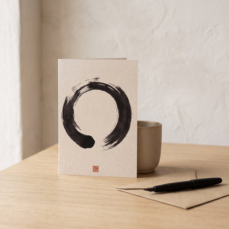
The best Japandi wall colours are warm whites, soft greige, muted clay and grey-green sage, chosen for the direction of light in the room rather than from a swatch under shop lighting. A north-facing room wants a white with a little yellow in it; a south-facing room can take a cooler, chalkier shade without turning cold. Below are twelve paint shades that hold up in real rooms, grouped by family, with notes on where each one works and the few that quietly ruin the calm.
This guide is only about the walls. For the whole scheme, floor to textiles, see our Japandi colour palette guide. Here we stay with the biggest surface in the room, because it sets the key for everything else.
Why light direction matters more than the swatch
Paint does not have a fixed colour. It has a pigment and borrows the rest from whatever light falls on it. In our Copenhagen studio the north light is blue-grey for most of the year, and a white that looked creamy in the tin reads as cold porridge by mid-afternoon. The same tin in a south-facing room in Lisbon would glow.
So before choosing, work out where your windows face. North light is cool and even; south light is warm and strong; east light is bright and clean in the morning and flat later; west light is grey until late afternoon, then golden. Each of the shades below carries a note on which of these it suits.
Warm whites: the default Japandi wall colour
Most Japandi rooms should start here. A warm white has a whisper of yellow, red or brown in it, which stops it looking clinical against oak, paper and linen. Go warmer than feels natural in the shop, because the sample card is lit by cool fluorescent tubes.
- Chalk white with a drop of ochre. The gentlest starting point. It reads as plain white next to a pure white ceiling but carries enough warmth to flatter pale wood. Works in every orientation; in a north room it is the safest choice on this list.
- Rice-paper white. Slightly greyer than chalk white, closer to the tone of shoji paper. Suits south and west rooms where a yellower white would go custard by evening.
- Warm off-white with a pink undertone. Barely there in daylight, it comes alive under warm bulbs and makes skin and terracotta look well. Best in north and east rooms; avoid it if you have a lot of cool grey furniture.
Greige and mushroom: for rooms with hard edges
Greige sits between grey and beige and takes the shine off white walls without darkening the room much. It is the right answer when a space has a lot of white built-ins, glossy floors or glass and needs softening.
- Pale mushroom. A beige-leaning greige with a faint violet cast. Lovely in south rooms, where the warmth of the light balances the grey. In a north room it can look like a shadow.
- Light stone. Greyer and drier than mushroom, close to the colour of unglazed stoneware. Works in east and west rooms and pairs naturally with black-framed art and darker oak.
- Putty. The warmest greige, almost a very pale tan. Good in north light because the yellow in it fights the blue. Keep the trim the same colour, one sheen up, or the contrast will look dated.
Clay and plaster tones: when you want the walls to feel made
These shades come from the wabi-sabi side of Japandi: the colour of raw plaster, dried earth and unglazed pots. They work best on one wall, in a hallway, or in a small room where you want enclosure rather than airiness.
- Pale plaster pink. Not a sugary pink but the colour of lime plaster before it is painted. Suits north rooms, where it warms the light without shouting. Pair it with black and natural oak, never with bright white trim.
- Dusty clay. A muted terracotta with a lot of grey in it. In south light it glows; in north light it goes brown and flat, so use it there only with plenty of lamp light. One wall behind a bed or sofa is enough.
- Sand. A dry, pale ochre. Reads as neutral from across the room but adds obvious warmth. Good for west-facing rooms that are gloomy until late in the day.
Sage and grey-green: the quietest colour in the room
Green is the only true colour that Japandi rooms carry on the walls comfortably, and only when it is greyed down to the point of ambiguity. If someone can name it as green at first glance, it is probably too strong.
- Pale sage. A grey-green that reads as a warm grey in low light and a soft green by the window. Works in every orientation but is at its best in east rooms, where the morning light finds the green.
- Lichen. Greener and slightly yellower than sage, like the colour on the north side of an old stone wall. Suits south rooms; north light can turn it minty.
- Eucalyptus grey. The bluest of the three, closer to a green-grey. Use it in warm south or west rooms only; anywhere else it will feel cold beside oak and linen.
Shades to avoid, and why
Pure brilliant white is the most common mistake. It has optical brighteners that push it towards blue, and against oak and paper it looks like a rented office. If you love white, choose one of the warm whites above and paint the ceiling the same shade.
Cool mid-greys were everywhere for a decade, and they are the reason so many rooms that call themselves Japandi feel Scandinavian-cold instead. The difference is undertone, which we unpack in our piece on warm versus cool neutrals. A grey with a blue or violet base will fight every warm material in the room.
Saturated colour of any kind, including deep navy and forest green, demands more black and more drama than most Japandi rooms want. Save the strong tones for a cushion or a piece of art.
Finally, avoid a high-sheen finish. A matt or dead-flat emulsion absorbs light and makes any of the shades above feel like plaster rather than plastic.
Testing and matching your chosen shade
Once you have narrowed it to two or three, paint sample pots onto A3 card rather than the wall, so you can move them. Look at them at 8am, 1pm and 9pm under your lamps, and put one on the wall furthest from the window. That wall is the one that will disappoint you if the shade is wrong.
If you are planning in software or on a moodboard first, our list of Japandi colour palette hex codes gives screen values for these same families, which most paint mixing desks can match to a physical chip. Let the sample board make the final decision.
One wall colour, held steady
The rooms that feel most calm are not the ones with the most interesting paint. They are the ones where the wall colour is right for the light and then left alone, so that wood, linen and a single piece of ink art have a still background to sit on.
Choose your Japandi wall colours for the direction your windows face, test them over two days, and go one notch warmer than the shop card suggests. Everything else in the room will thank you for it.
Worth considering
A few well-made pieces we would happily put next to our own. These are Amazon links; as an Amazon Associate we earn from qualifying purchases, at no cost to you.
- Collapsible rice-paper lantern pendant (cream) — Paper diffuses a bulb into the soft, even light that lets a warm white read as warm rather than yellow.
- Yunaking plug-in linen wall sconce pair, warm 2700K — A warm, dimmable wash at wall height, useful in north-facing rooms where the paint needs help after dark.
- Light wood floating wall shelves, set of 3 — Pale wood against a warm white or greige wall is the pairing most of these shades are chosen for.
Frequently asked questions
What is the best white paint colour for a Japandi room?
A warm white with a small amount of ochre or red in it, rather than a brilliant white. In north-facing rooms, go warmer still; in south-facing rooms, a chalkier rice-paper white avoids turning yellow.
Can you use grey walls in Japandi style?
Yes, but only warm greys, greige and stone tones. Cool blue-based greys are the reason many Japandi rooms feel cold. Hold the sample next to oak: if the wood looks orange, the grey is too cool.
Should Japandi walls and ceilings be the same colour?
Usually, yes. Painting the ceiling the same warm white or greige as the walls removes a hard line and makes a room feel taller and quieter. Use the flattest finish available on both.