Japandi accent colours are muted, earthy and used sparingly: sage, dusty clay, indigo, ochre and moss, each greyed down and kept to roughly ten percent of what you see in a room. One accent per room is the rule, and it usually arrives through textiles rather than paint. This guide explains the ten percent rule, how to pick your one accent, and where to put it so the room stays calm.
The whole scheme, base and supports included, is laid out in our Japandi colour palette guide. Here we deal only with the small, deliberate dose of colour that stops a neutral room from feeling like a waiting room.
The ten percent rule for Japandi accent colours
Stand in the doorway and imagine everything you can see as a hundred squares. Around sixty of them should be your base neutral: walls, ceiling, the largest floor area. Thirty should be the supporting tones of wood, linen and stone. The last ten, at most, are your accent. That is one rug border, two cushions and a bowl, or one throw and a print. Not more.
This is a cousin of the 30-30-30 rule we use for materials, and it works for the same reason. Restraint is what lets a colour register. A single clay cushion on an oat sofa reads as a decision; five of them read as a theme.
If you find yourself wanting more, the answer is almost always to vary the texture of the accent rather than add more of it. One colour in chenille, in linen and in glaze looks richer than three colours in the same weave.
Which accent: sage, clay or indigo
Most Japandi rooms choose from a short list. The right one depends on the light and on the wood you already own.
Sage and moss
Grey-green is the most forgiving accent because it behaves like a neutral from across the room and only shows its colour up close. It suits pale oak, ash and birch, and it is the natural choice for a room with a view of trees. Keep it greyed; a clean mint or a bright olive tips the room into another style.
Clay, persimmon and ochre
The warm family. Dusty terracotta and a muted persimmon orange flatter darker woods and cooler, north-facing light, where they warm the room without paint. Ochre works the same way but is easier to overdo, so keep it to one object. These tones also sit beautifully with black, which makes them the accent to choose if you own a lot of ink art.
Indigo
The one blue we recommend. Traditional indigo is dusty and slightly grey, nothing like navy, and it reads as calm rather than cold when it sits against warm white and oak. It is the natural accent for bathrooms and bedrooms, where towels and bedding can carry it, and it works best in rooms with warm afternoon light.
One accent per room, held consistently
The mistake most rooms make is not too much colour but too many colours. A sage cushion, a rust throw and an indigo vase in one living room each look fine alone and add up to noise. Choose one accent family for the room and repeat it three times at different scales: something large and soft, something small and hard, and one natural thing.
A living room with a clay accent might have a throw folded over the sofa arm, a glazed bowl on the coffee table and a single dried seed head in a bottle. The three echo each other without matching. Nobody notices the system, only that the room feels resolved.
Between rooms you can change the accent, and in a small home it is often better not to. If the living room is sage and the bedroom is clay, the doorway between them becomes a border. One accent across a whole flat is the quieter option, and our guide to Japandi colour in a small apartment sets out how to carry it through.
Why textiles are the best place for accent colour
Paint is a commitment and furniture is expensive. A cushion cover, a throw, a curtain or a rug is where colour can live cheaply, be swapped with the seasons and be tested before anything permanent happens. Textiles also soften the colour: the same clay tone that looks hard as a painted wall looks warm as a woven throw, because the fibre catches light unevenly.
A practical order of operations, if you are adding an accent to an existing neutral room:
- Start with the largest textile you will change. A rug or a curtain sets the accent at scale. If the accent lives here, everything else can be quieter.
- Add one soft repeat. A cushion or throw in the same family, in a different texture. This is usually where the colour becomes visible.
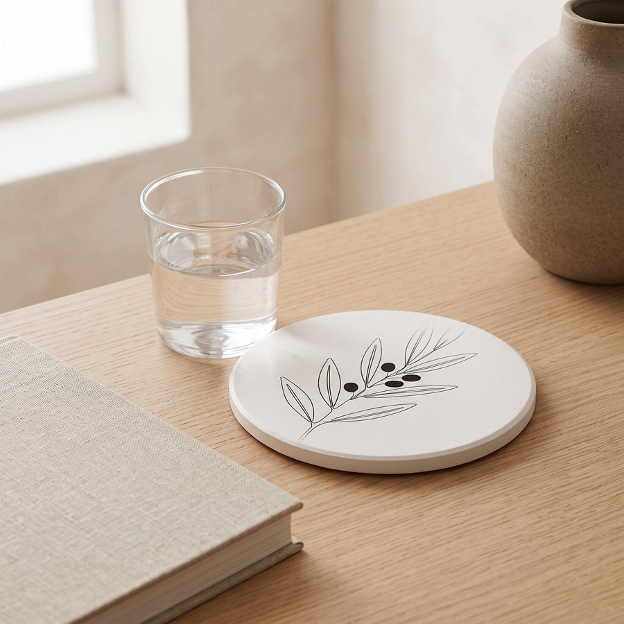
- Finish with one hard object. A glazed cup, a coaster, a printed card in a frame. The accent is now in three materials and the room is done.
Resist the fourth item. If the room still feels bare, the answer is a plant, a lamp or a piece of art in ink and paper, none of which add colour.
Accents to avoid
Bright, saturated colour of any kind: cherry red, cobalt, lemon yellow, emerald. These belong to other styles and they will dominate a room built on quiet neutrals. If you love a strong colour, look for its greyed, earthy cousin: rust instead of red, indigo instead of cobalt, ochre instead of lemon, moss instead of emerald.
Cool pastels are a subtler trap. Baby blue, lilac and pale mint look soft on a screen but read as chilly and slightly nursery-like against oak and linen. Warm the pastel until it is almost a neutral, or choose a different family.
And avoid matching. An accent that appears in the identical shade on the cushions, the rug and the art looks like a set. Aim for a family of tones, lighter and darker versions of the same colour, and the room will look collected rather than bought.
A little colour, decided once
The calmest rooms are not colourless; they have one accent, chosen for the light and the wood, repeated in three textures and then left alone. That is the whole method, and it costs less than a tin of paint.
Choose your Japandi accent colours from the muted end of the spectrum, keep them to a tenth of what you see, and let textiles do the carrying. If you want exact values to work from on screen, our list of Japandi colour palette hex codes includes each of these accents in a full five-tone scheme.
Worth considering
A few well-made pieces we would happily put next to our own. These are Amazon links; as an Amazon Associate we earn from qualifying purchases, at no cost to you.
- Brown ceramic centerpiece vase — The glazed vessel in a clay accent scheme: one small, hard object that echoes the textiles.
- Dried pampas stems — The one natural thing in the sequence; it adds texture without adding another colour.
- Jonathan Y hyacinth basket lamp — If the room still feels bare, a lamp in natural fibre fills it without breaking the ten percent rule.
Frequently asked questions
What colours go with Japandi style as accents?
Muted, earthy tones: sage and moss green, dusty clay and persimmon, ochre, and a greyed indigo blue. Each should look slightly faded rather than fresh, and one family per room is enough.
How much accent colour should a Japandi room have?
Around ten percent of what you see from the doorway. In practice that is one large textile plus one or two small objects, or a throw and a print. If you can count more than three accent-coloured things in a room, remove one.
Can you use blue in a Japandi colour scheme?
Yes, if it is indigo: dusty, slightly grey and deep. Bright navy, cobalt and pale sky blue all fight the warm neutrals the style depends on. Keep indigo to textiles such as towels, bedding and a single cushion.