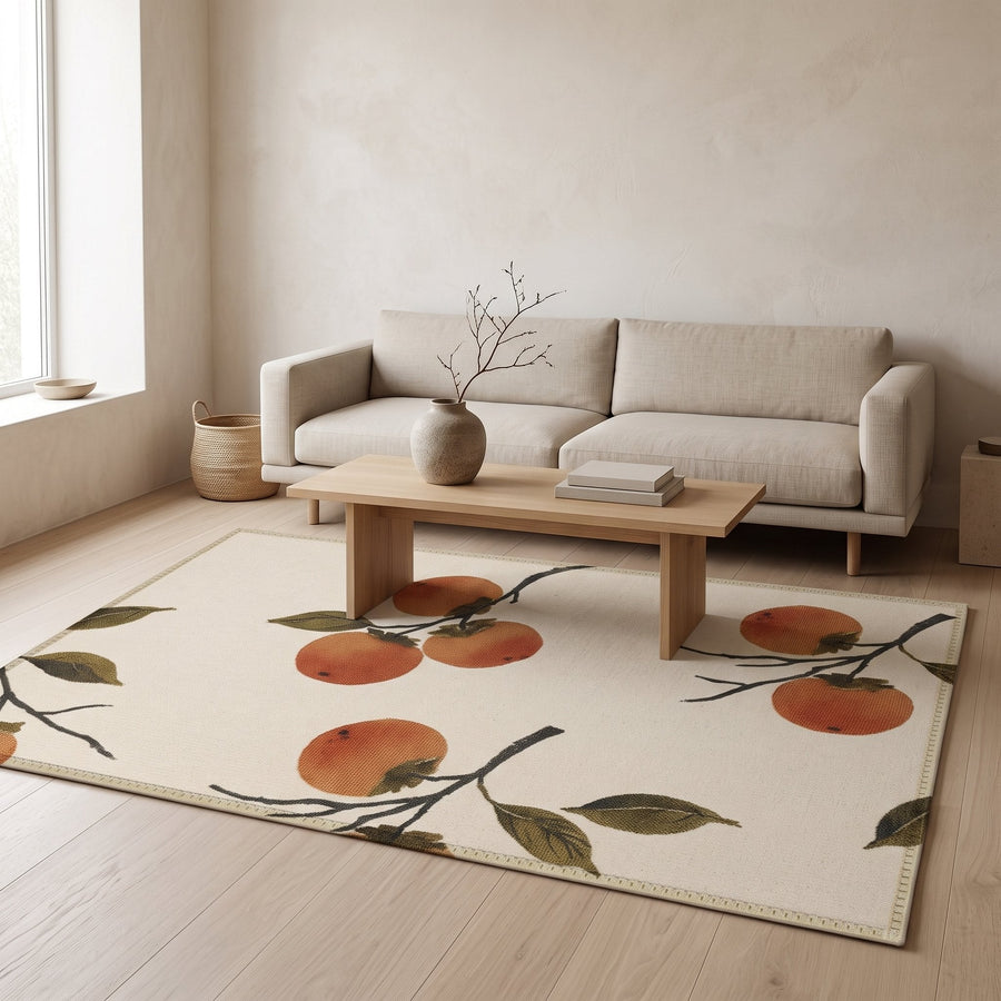
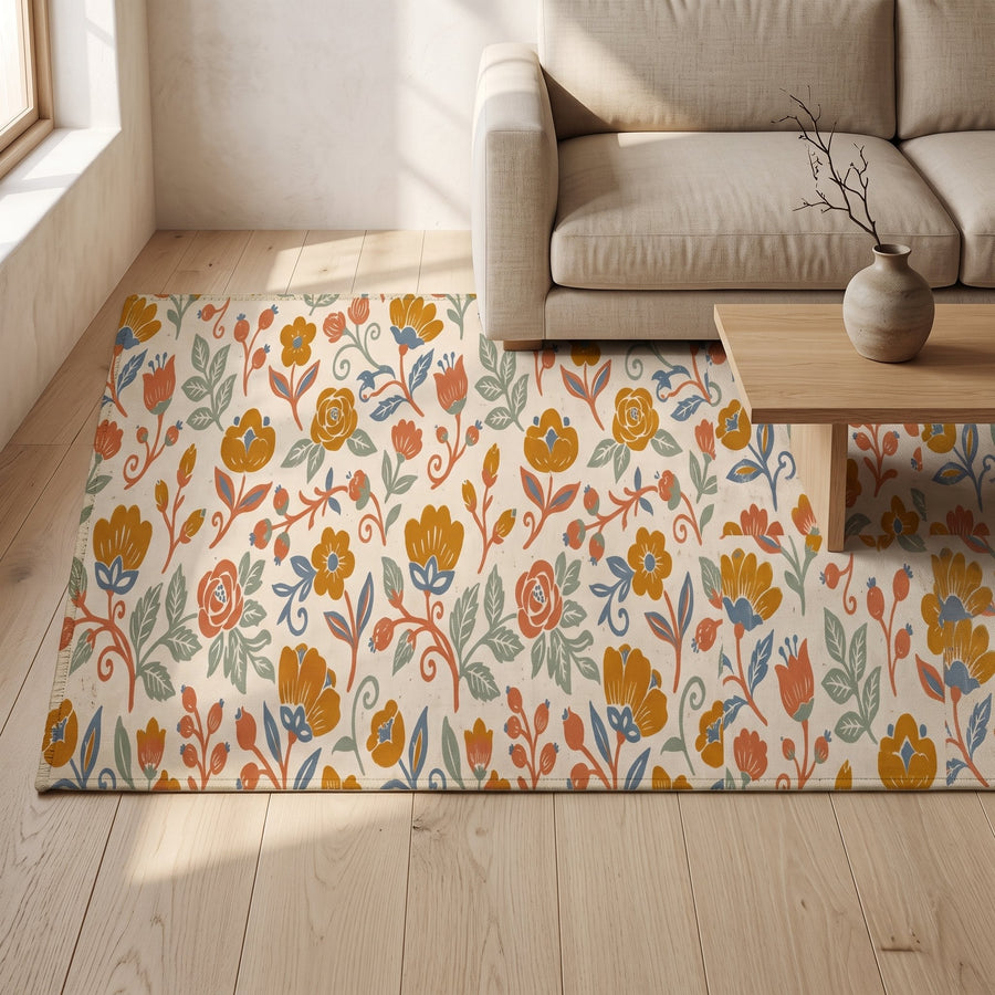
The best Japandi colour palette for a small space is a single palette used in every room: one warm wall colour throughout, one wood tone, and a short list of textile colours that move from room to room. In a small apartment you can often see three rooms from one spot, so continuity matters more than any individual shade. When the colours agree, the walls seem to step back and the whole flat reads as one calm space.
This guide shows how to build that palette, how to apply it to five rooms, and how to use textiles as a map that ties everything together.
Why continuity beats contrast in a small flat
In a large house, each room can have its own character because you rarely see two at once. A small apartment is different. Doorways line up, the kitchen opens to the living room, the bedroom door stays open. Every change of colour is visible, and each one draws a line that makes the space feel more divided.
A continuous palette removes those lines. When the hallway, living room and bedroom share a wall colour, the eye travels through without stopping, and the flat feels larger than its floor area. This is the same principle Japanese homes have long used with sliding screens and consistent materials: rooms flow because nothing interrupts them.
It also makes decisions easier. Once the palette is set, every new cushion, towel or print has a simple test to pass. Our guide to starting Japandi on a budget makes the same point about money: fewer, consistent choices waste less.
Building one palette for the whole apartment
A workable small-space palette has five parts. Keep the list somewhere visible, such as a note on your phone, and refer to it whenever you buy something.
- One wall colour. A warm soft white or very pale greige, used on every wall and, ideally, the ceiling too. Painting the ceiling the same colour blurs the edges of the room and makes low ceilings feel higher.
- One main wood tone. Light to mid oak is the most forgiving. If you have a second wood, keep it close in tone and use it sparingly.
- Two textile base colours. Usually oat and a soft grey-brown, or sand and stone. These go on the large textiles: sofa, curtains, bedding, rugs.
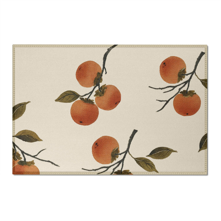
- One accent colour. A single earthy accent such as persimmon, clay, moss or indigo. It appears in small doses in every room, which is what stitches the apartment together.
- One dark note. Warm charcoal or ink black for frames, a lamp, a single print.
If you need help choosing the individual shades, our main Japandi colour palette guide lists tested whites, greiges and accents. For small spaces, choose the lighter end of each range.
One palette, five rooms
Here is how the same five-part palette plays out across a typical small apartment. The walls and wood stay constant; what changes is the balance of textiles and how much of the accent appears.
Entrance
The entrance sets the palette before anyone sees the living room. Keep it light: the wall colour, a wooden hook rail or bench in your main wood, and one small touch of the accent, perhaps a runner or a print. Our Japandi entryway guide covers storage for narrow halls.
Living room
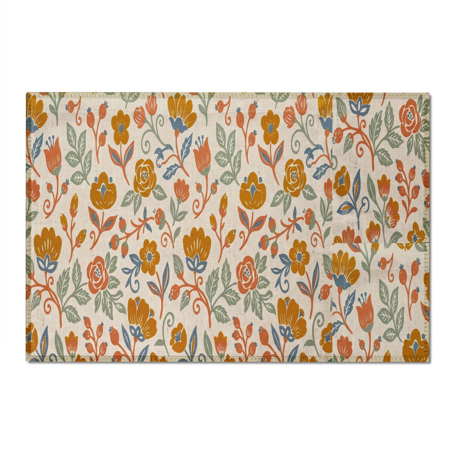
The living room carries the most textiles, so it shows the palette at full strength. Sofa in one base colour, curtains in the other, a rug that mixes both with a little of the accent. Add the accent once more in a cushion and once in art. The dark note can appear in a lamp or frame.
Kitchen
Kitchens in small apartments are often visible from the sofa, so they need to agree with the living room. Let wooden boards, a tea towel in a base colour and one accent piece such as an apron or a mug do the work. Keep worktops as clear as possible.
Bedroom
The bedroom can lean quieter. Use the base colours for bedding and curtains and reduce the accent to a single cushion or a throw at the foot of the bed. Blackout curtains in a warm neutral keep the room calm and stop it reading as a separate colour block when the door is open.
Bathroom
The bathroom is often the smallest room and the one most likely to be white tile. Bring it into the palette with towels in your base colours and one accent piece, perhaps a bath mat or a hand towel. That small repeat makes the bathroom feel like part of the home rather than a separate space.
The textile map: how the accent travels
A textile map is a simple plan of where each colour lives. Draw a rough outline of your apartment and mark every textile: rugs, curtains, cushions, throws, towels, bedding, table linen. Then colour them in with your palette.
What you are looking for is rhythm. The accent colour should appear in every room, but only once or twice. The base colours should cover the large items. If you see a room with no accent at all, it will feel disconnected. If you see one room with four accent pieces, it will pull focus from everything else.
A typical map for a one-bedroom apartment might look like this:
- Entrance: runner in base colours with a thin accent stripe or motif.
- Living room: rug with accent pattern, one accent cushion, oat sofa, sand curtains.
- Kitchen: accent apron or tea towel, wooden boards.
- Bedroom: oat bedding, one accent cushion, stone-coloured curtains.
- Bathroom: base-colour towels, accent hand towel or bath mat.
The map also helps you edit. If you own a cushion that does not fit any slot, it can go. Our guide to layering textiles covers how to mix textures within this kind of restrained colour scheme.
Small-space mistakes to avoid
- A feature wall in each room. Accent walls divide a small apartment into boxes. Keep walls consistent and let textiles carry colour.
- Too many accent colours. Two accents can work in a large home. In a small one, a second accent usually reads as clutter. Choose one and commit.
- Bright white everywhere. A cold, bright white can make a small flat feel like a rental rather than a home. A warm white keeps the space soft. Our article on warm vs cool neutrals explains how to test the difference.
- Dark floors with pale walls and nothing between. If your floor is dark, add mid-tone rugs to bridge the gap; otherwise the floor reads as a separate block.
A calm Japandi colour palette for a small space
Small apartments reward discipline. One wall colour, one wood, two base textiles, one accent and one dark note will carry you through every room, and each new purchase becomes easier because the palette has already made half the decision.
The result is a flat that feels larger, quieter and more considered than its size suggests. A Japandi colour palette for a small space is less about finding the perfect shade than about repeating a few good ones with care. If you are renting and cannot repaint, the same approach still works through textiles alone, as our guide to the Japandi rental apartment shows.
Worth considering
A few well-made pieces we would happily put next to our own. These are Amazon links; as an Amazon Associate we earn from qualifying purchases, at no cost to you.
- Collapsible rice-paper lantern pendant (cream) — Easy to repeat from room to room, which is how continuity is built in a small flat.
- GIB seagrass basket set, 3 pieces — Three baskets in one material, so storage can move between rooms and still look like one palette.
- Light wood floating wall shelves, set of 3 — One wood tone on the wall in every room, keeping the apartment in a single key.
Frequently asked questions
Should every room in a small apartment be the same colour?
For the walls, usually yes. A single warm white or pale greige throughout makes the apartment feel larger and lets textiles carry the variety. You can shift the balance of base and accent colours room by room without changing the paint.
What accent colour works best in a small Japandi apartment?
Earthy, slightly muted accents work best: persimmon, clay, moss green or a soft indigo. Choose one and repeat it in small doses in every room. Bright or saturated accents tend to dominate a small space.
Do dark colours make a small room look smaller?
Dark walls can make a small room feel enclosed, but dark accents used sparingly do not. A few thin black frames or a charcoal lamp give definition without shrinking the space, as long as the walls and large textiles stay light.