To frame art prints well, you need four decisions in the right order: a mount that gives the image room, a frame material that suits the wood already in the room, a glazing that controls glare and light, and a print size that matches a standard frame so none of this costs a fortune. Get those four right and almost any print, from a postcard to a large landscape, will look considered rather than merely hung.
This is how we frame our own work for the studio walls and for customers who ask. It is written for the Japandi home, where the frame should be quiet, but the principles hold anywhere.
How to frame art prints: start with the mount
The mount, called a mat in North America, is the card border between the print and the frame edge. It is the single biggest difference between a print that looks framed and one that looks like a poster in a frame, and it is where most people go wrong by making it too narrow.
Width
For prints up to A3, a mount of 5 to 8 centimetres on each side is the comfortable range; for larger prints, 8 to 10 centimetres. A generous mount lets the image breathe and makes a small print feel deliberate rather than mean. Many framers add a fraction more at the bottom edge than at the top, which corrects an optical illusion that makes equal borders look bottom-heavy.
Colour
Off-white, not brilliant white. A soft, warm white mount sits with the paper of most fine-art prints and with the warm neutrals of a Japandi room; a bright white mount makes the paper look yellow by comparison. Save coloured or black mounts for a dark room with a dark scheme, and even then use them sparingly.
Quality
Ask for acid-free or conservation mount board. Cheap board yellows and can stain the print at the bevel within a few years. It costs a little more and is the difference between a print that lasts a decade and one that lasts a lifetime.
Oak or black: choosing the frame
In a Japandi room the frame has two jobs: to hold the print and to agree with the furniture. That usually means one of two options.
- Natural oak or ash. The default. A slim, pale wood frame joins the print to the oak table, the ash bed or the birch shelves already in the room, and it warms a black-ink print without competing with it. Keep the profile narrow, around 1.5 to 2 centimetres, and the finish matt.
- Black. Right when the room already has black in it, such as a black lamp, a dark steel table base or charcoal curtains, or when the scheme is deliberately deep. A black frame gives an ink print more contrast and more formality. Again, keep it slim.
- Walnut or dark wood. Use only if walnut is one of the two woods in the room. Mixing a third wood in the frame is the most common framing mistake we see; our two-woods rule explains why two is enough.
- White. Works with white walls and pale floors, though it can disappear. Best for a set of small prints where you want the images, not the frames, to register.
If the room is undecided, oak. It is the choice we make nine times out of ten, and it has the advantage of looking right whether the print is a botanical, a landscape or a single ensō. For the wider question of balancing wood, textile and stone across a room, our 30-30-30 rule is the place to start.
Glazing: glass, acrylic and reflections
The glazing is the layer in front of the print, and it affects how the print looks in daylight and how long it lasts.
- Standard glass. Clear, cheap and heavy. Fine for small frames in rooms without a window opposite. Its drawback is reflection: a print facing a window can vanish behind the glare.
- Anti-reflective glass. Coated so that you see the print rather than the room. Worth the extra cost for anything larger than A3 or anything hung opposite a light source. It makes matte paper look almost unglazed.
- Acrylic. Lighter than glass and shatterproof, which matters for large frames, for anything above a bed and for homes with children. It scratches more easily and holds static, so use an anti-static cloth when cleaning. UV-filtering acrylic is available and is the best choice for a print in a sunny room.
- No glazing. Possible for a canvas or for a print you accept will age. Not recommended for fine-art paper, which is porous and marks easily.
Whatever you choose, keep the print off the glass. A mount does this automatically; if you frame without one, ask for spacers, because a print pressed against glazing can stick or ripple in humid weather.
Float mounting: when to let the edges show
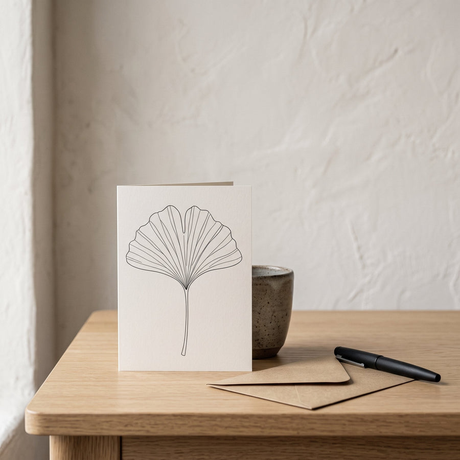
A float mount fixes the print to a backing board so it appears to hover inside the frame, with its edges visible and a border of empty backing around it. It suits prints with a deckled or torn edge, heavy textured paper and anything where the paper itself is part of the piece. It is also the right way to frame a greeting card you want to keep, because the card's edges and weight are what make it feel like an object rather than an image.
Float mounting needs a deeper frame, usually called a box or shadow frame, and archival hinging tape rather than glue. It costs more than a standard mount and is worth it for a favourite piece. The effect is quieter than a conventional mount and pairs well with the empty-space principle in our piece on the art of negative space.
Standard sizes and why they save money
Custom framing is expensive; standard framing is not. The trick is to buy prints in sizes that match off-the-shelf frames, or to buy a frame one size up and use the mount to bridge the difference. The sizes worth knowing:
- A series (Europe, UK, Australia, Japan): A4 (21 × 29.7 cm), A3 (29.7 × 42 cm), A2 (42 × 59.4 cm). An A4 print in an A3 frame with a mount is the most economical combination there is.
- North American sizes: 8 × 10, 11 × 14, 16 × 20, 18 × 24 and 24 × 36 inches. An 8 × 10 print in an 11 × 14 frame, or an 11 × 14 in a 16 × 20, follows the same logic.
- Square and 2:3 formats: 30 × 30 cm and 50 × 70 cm are widely stocked in Europe; 12 × 18 and 24 × 36 inches cover the 2:3 ratio in the US.
Our guide to art print sizes explained goes through what fits above which piece of furniture. And if you are still choosing between paper and canvas, our comparison of canvas and framed prints sets out when a frame is worth having at all.
Hanging and finishing
Hang so the centre of the image sits around 145 to 150 centimetres from the floor, a little lower above a sofa or bed, where the piece should relate to the furniture rather than to a standing viewer. Use two hooks rather than one for anything wider than 50 centimetres, so the frame does not tilt. Wipe the glazing with a dry microfibre cloth; never spray cleaner directly at the frame, because it can run under the glass.
Finally, step back and check the room, not the frame. A well-framed print should be the last thing you notice about the wall and the first thing you notice about the picture.
Quiet frames, clear pictures
Knowing how to frame art prints is mostly knowing what to leave out: a wide mount rather than a decorative one, a slim frame in a wood the room already has, glazing that gets out of the way, and a size that matches something off the shelf. None of it is expensive, and all of it is visible.
Frame one print well before you frame five. Once you have seen what a proper mount does, you will not go back.
Frequently asked questions
How wide should the mount be when framing an art print?
For prints up to A3, aim for 5 to 8 centimetres on each side; for larger prints, 8 to 10 centimetres. A mount that is too narrow makes a print look cramped, while a generous one makes even a small print feel intentional. Many framers add slightly more at the bottom edge to balance the eye.
Should I use glass or acrylic to frame prints?
Use glass for small frames in rooms without strong reflections, and anti-reflective glass for anything large or opposite a window. Choose acrylic for big frames, for pieces hung above a bed or where safety matters, and UV-filtering acrylic for sunny rooms. Keep the print off the glazing with a mount or spacers in every case.
What is the best frame colour for Japandi art prints?
Slim natural oak or ash is the usual choice, because it ties the print to the pale wood furniture typical of the style and warms a black-ink image. Use a slim black frame if the room already has black accents or a deep colour scheme. Avoid introducing a third wood tone that the room does not already contain.